
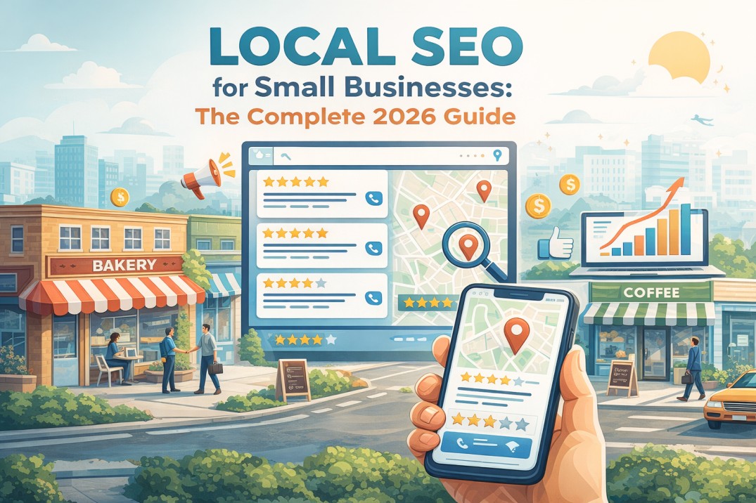
In the realm of digital marketing, the distinction between GEO (Generative Engine Optimization) and SEO (Search Engine Optimization) is becoming increasingly significant. Are you investing enough in the right strategy to boost your brand awareness and user experience? This article will dissect the roles of GEO and SEO, compare their effects on marketing strategy, and provide actionable insights for businesses on a budget. Readers will learn how to harness both approaches to enhance their online presence and tackle the challenge of staying visible in a crowded search engine landscape. By the end of this piece, you’ll have a clearer understanding of how to effectively integrate generative AI into your digital marketing efforts for maximum impact.
Key Takeaways
- Generative AI enhances SEO by creating tailored content and optimizing keyword strategies
- GEO leverages AI for precise targeting and improved ad copy, leading to better engagement
- Training in AI tools is crucial for teams to maximize digital marketing strategies effectively
- Ethical considerations in AI use include maintaining content authenticity and safeguarding user data
- Measuring AI’s impact on marketing is essential for refining strategies and proving ROI
Understanding GEO and SEO in Digital Marketing
In the realm of digital marketing, Search Engine Optimization (SEO) serves as the foundation for enhancing visibility on platforms like Google Ads and Microsoft Advertising. As businesses refine their content marketing strategies through research, Generative Engine Optimization (GEO) emerges, leveraging generative AI to tailor contextual advertising. This intersection of technology and marketing practices is reshaping how brands connect with their audiences, promising a new frontier for engagement and growth.
Basics of Search Engine Optimization (SEO)
Search Engine Optimization, commonly known as SEO, is the strategic process of enhancing a website’s presence in organic search results. It involves optimizing various elements such as the content, structure, and on-page metadata of a landing page to appeal to both search engines and the target audience. By focusing on relevant keywords and creating valuable content, businesses aim to rank higher in search results, thereby increasing visibility and driving more traffic to their site without the direct cost of advertising.
Introduction to Generative Engine Optimization (GEO)
Generative Engine Optimization (GEO) is an innovative approach in digital marketing that integrates generative artificial intelligence with traditional SEO practices to enhance online advertising strategies. By conducting advanced keyword research and analyzing search engine results pages, GEO assists marketers in creating highly optimized content for search advertising, ensuring that their messages resonate with the intended audience. This synergy between AI-driven insights and search engine marketing tactics offers businesses a competitive edge in crafting campaigns that are both relevant and compelling.
The benefits of incorporating GEO into a marketing strategy are manifold and include the following:
- Improved accuracy in targeting through data-driven keyword research.
- Enhanced customization of ad copy to align with user search intent.
- Increased efficiency in adapting to the dynamic nature of search engine results pages.
The Influence of Generative AI on Marketing Practices
The advent of generative AI in marketing has revolutionized the way brands analyze data and engage with their audiences. By integrating tools like Google Analytics into their strategies, companies can now harness the power of AI to refine user experience design, bolster lead generation, and enhance brand presence. This technology sifts through vast amounts of analytics, identifying patterns and insights that inform more effective marketing decisions, ultimately leading to a more personalized and impactful interaction with consumers.
")
The Transformation of Digital Marketing Strategies
Digital marketing strategies are undergoing a significant transformation as traditional SEO methods encounter limitations in a data-rich internet environment. The impact of AI on consumer engagement is profound, influencing web design, email marketing, and other facets of digital communication. The following sections will delve into these changes, offering insights into how businesses can adapt to remain competitive and connect more effectively with their audience.
Limitations of Traditional SEO Methods
Traditional SEO methods often struggle to keep pace with the rapid changes in Google search algorithms, leading to a decline in the effectiveness of static information and copywriting strategies. As a result, businesses may see a diminished return on investment when relying solely on outdated tactics. The industry’s shift towards dynamic, AI-driven content creation underscores the need for a strategy that adapts in real-time to the evolving digital landscape, ensuring that marketing efforts align with current search behaviors and preferences.
Impact of AI on Consumer Engagement
Artificial intelligence is transforming consumer engagement in marketing by enabling more personalized and efficient interactions. Through AI’s data management capabilities, businesses can automate and optimize their auction-based advertising for increased visibility. This level of customization ensures that marketing efforts resonate more deeply with target audiences, fostering a connection that is both meaningful and conversion-oriented.
The story of digital marketing’s evolution with AI at the helm unfolds as follows:
- AI-driven analytics provide a deeper understanding of consumer behavior, allowing for more targeted marketing strategies.
- Automated auction systems for ad placements use AI to ensure optimal visibility and cost-effectiveness.
- Artificial intelligence enhances customer relationship management by predicting needs and personalizing communication.
Generative AI’s Impact on SEO Practices
Generative AI’s impact on SEO practices is multifaceted, encompassing the creation of content with AI tools, the enhancement of keyword strategies, and the personalization of user experiences. These innovations offer a competitive edge in competitor analysis, customer relationship management, and conversion rate optimization. The subsequent sections will delve into how these AI-driven approaches are redefining the experience of both businesses and consumers in the digital marketing landscape.
Creating Content with AI Tools
Generative AI is revolutionizing the creation of digital content, enabling marketers to address competition and influencer marketing with unprecedented precision. By analyzing vast datasets, AI tools can suggest content that not only enhances the customer experience but also optimizes for relevant keywords, improving a website’s URL ranking. This approach reduces the cost and time associated with content development while ensuring that the material resonates with the intended audience, ultimately driving engagement and conversions.
Enhancing Keyword Strategies Using AI
Integrating generative AI into keyword strategy development enables a company to conduct a comprehensive audit of its digital presence, identifying opportunities to align content with customer search behaviors. This advanced analysis not only refines native advertising efforts but also drives revenue by ensuring that the company’s offerings meet the specific needs and interests of its target audience. By leveraging AI, marketers can craft keyword strategies that are not only data-driven but also highly responsive to market dynamics, resulting in a more effective and competitive online footprint.
Personalizing User Experiences Through AI
Generative AI is transforming the personalization of user experiences on web pages, enabling a level of precision in digital marketing that was previously unattainable. By analyzing user behavior and preferences, this tool can dynamically adjust content, calls to action, and even the overall layout to enhance the user’s journey. Such tailored experiences not only improve a web page’s quality score but also reinforce leadership in market niches by meeting specific user needs, thereby fostering higher engagement and conversion rates.
Comparing GEO and SEO: Key Differences and Similarities
In the dynamic sphere of online marketing, distinguishing between Generative Engine Optimization (GEO) and Search Engine Optimization (SEO) is essential for any agency aiming to excel. This section examines the techniques and technologies each employs, their approaches to audience targeting, and the metrics used to gauge success. As the digital landscape evolves, so does the media mix, necessitating a seamless integration of SEO services, website design, and tailored content strategies. The following discussions will provide insights into how these elements converge to shape effective digital marketing campaigns.
Techniques and Technologies Used
In the competitive arena of digital marketing, Generative Engine Optimization (GEO) and Search Engine Optimization (SEO) employ distinct techniques and technologies to secure a lead in market visibility. GEO, guided by generative AI, empowers a performance marketing agency to craft content that embodies thought leadership, ensuring that media buying is informed by data-driven insights. Conversely, SEO focuses on optimizing existing web content and structure to improve organic search rankings, a fundamental aspect of sales enablement. Both strategies are pivotal for a business’s online success, with GEO offering a cutting-edge approach to content creation and SEO providing a robust foundation for sustainable online growth.
Approaches to Audience Targeting
In the context of digital marketing, Generative Engine Optimization (GEO) and Search Engine Optimization (SEO) take distinct approaches to audience targeting. GEO utilizes generative AI to create social content that resonates with the culture and behaviors of a specific audience, thereby generating more qualified leads and increasing web traffic. In contrast, a digital marketing agency employing SEO strategies focuses on optimizing content and keywords to attract a broad audience, aiming to improve organic search rankings and visibility.
- GEO crafts personalized content that aligns with audience culture, enhancing lead quality.
- SEO optimizes for broader reach, improving organic rankings and web traffic.
Metrics for Measuring Success
Success in digital marketing, whether through Generative Engine Optimization (GEO) or Search Engine Optimization (SEO), hinges on the ability to measure the return on investment effectively. Organizations increasingly rely on tools like SEMrush to track algorithm changes and their impact on search rankings, while also monitoring sales conversions to gauge the efficacy of targeted content strategies. By analyzing these metrics, businesses can refine their marketing approaches, ensuring that investments in GEO and SEO yield tangible benefits and drive sustainable growth.

Integrating GEO Into Your Marketing Approach
As the digital marketing landscape evolves, integrating Generative Engine Optimization (GEO) into one’s marketing strategy becomes imperative. Selecting the right generative AI tools is crucial for enhancing local search engine optimization and social media marketing. Incorporating these AI technologies into existing workflows can capture attention and improve cost per action metrics. Training teams on AI technologies ensures that businesses can navigate the complexities of the World Wide Web effectively. The following sections will provide practical insights into these critical areas.
Selecting the Right Generative AI Tools
Selecting the right Generative AI tools for your marketing strategy is a critical step in ensuring the relevance and effectiveness of your campaigns. Tools like HubSpot offer advanced AI capabilities that can analyze backlink profiles and optimize ads, providing a competitive edge in the digital space. The key is to choose solutions that align with your business goals, enhance campaign performance, and contribute to a robust digital presence.
The integration of Generative AI into marketing efforts involves a strategic approach:
- Identify tools that offer comprehensive data analysis for improved campaign relevance.
- Assess the AI’s ability to generate high-quality content that can attract valuable backlinks.
- Ensure the chosen technology seamlessly integrates with existing platforms like HubSpot for streamlined campaign management.
Incorporating AI Into Existing Workflows
Incorporating generative AI into existing marketing workflows revolutionizes search marketing by automating and refining the process of advertising on search engines. When businesses integrate AI tools, they can optimize their strategies for platforms like Bing Ads and Google Ads, often at no additional cost. This seamless inclusion of AI not only streamlines the creation of content but also enhances the precision of SEO efforts, ensuring that the advertising search engine strategies are more effective and aligned with the evolving needs of the digital marketplace.
Training Your Team on AI Technologies
Equipping your team with the knowledge to effectively utilize AI technologies is a pivotal step in optimizing your digital marketing strategy. By providing training on the latest tools for Google Ads keyword optimization and Google Shopping ads, advertisers can enable their teams to create more targeted search ads, leading to improved campaign performance. This investment in education ensures that marketing personnel are proficient in leveraging AI to enhance ad relevance and audience engagement, thereby maximizing the return on investment for advertising efforts.
| Training Focus | Benefits | Tools |
| Google Ads Keyword Optimization | Enhanced targeting and ad performance | Keyword Planner, SEMrush |
| Google Shopping Ads | Increased visibility and sales conversions | Google Merchant Center, Google Ads |
| Creating Targeted Search Ads | Higher click-through rates and ROI | Google Ads, A/B Testing Platforms |
Case Studies: Success Stories with GEO and SEO
In the competitive landscape of digital marketing, companies are leveraging Generative Engine Optimization (GEO) and advanced SEO techniques to redefine their online presence. Company A’s success in boosting engagement through generative AI showcases the transformative power of technology in marketing search engine strategies. Meanwhile, Company B’s application of AI insights to enhance SEO strategies exemplifies the integration of data-driven methods in search engine advertisements. These case studies illuminate the impact of AI on crafting a superior digital experience and the efficacy of SEM campaigns, setting a benchmark for industry peers.
Company A: Boosting Engagement with Generative AI
Company A, a pioneer in SEO marketing, harnessed the capabilities of generative AI to identify untapped advertising opportunities, leading to a surge in campaign effectiveness. By employing a seasoned SEO specialist, the company refined its local SEO strategies, resulting in a significant uptick in user engagement and conversion rates. This strategic integration of AI not only optimized their marketing efforts but also set a new standard for precision in targeting and messaging within their industry.
Company B: Enhancing SEO Strategies with AI Insights
Company B, recognized as one of the best SEO marketing companies, has successfully integrated AI insights into its SEO digital marketing strategies, particularly in the realm of Google search advertising. By leveraging AI’s predictive analytics, the company refined its Google pay per click advertising campaigns, resulting in a marked improvement in both targeting precision and cost-efficiency. This strategic application of AI has not only bolstered the company’s reputation among SEO optimization companies but has also delivered substantial value to clients seeking to maximize their digital marketing investments.
Challenges and Ethical Considerations of GEO
As Generative Engine Optimization (GEO) gains traction in the digital marketing sphere, SEO agencies must confront the challenges of maintaining authenticity in AI-generated content, addressing data privacy concerns, and preventing bias in AI algorithms. These topics are critical for businesses leveraging Google PPC marketing and SEO marketing, as they navigate the complexities of advertising management and business intelligence. The subsequent sections will delve into these issues, offering insights into the ethical landscape of GEO and its implications for digital strategy.
Maintaining Authenticity in AI-Generated Content
In the pursuit of aligning user intent with digital content, maintaining the authenticity of AI-generated assets is paramount. The language produced by generative AI must reflect the knowledge and tone that resonate with the target audience, ensuring accessibility and relevance. Marketers must balance the efficiency of AI with the need for genuine connection, crafting content that upholds the brand’s integrity while meeting the informational needs of consumers.
Addressing Data Privacy Concerns
As businesses harness Generative Engine Optimization for local search enhancement, the safeguarding of personal data, such as email addresses, becomes a critical concern. An expert in digital marketing must ensure that the use of AI in crafting compelling headlines and content does not compromise user privacy. It is incumbent upon the business to implement robust data protection measures, thereby maintaining trust and upholding ethical standards in the collection and utilization of consumer information.
Preventing Bias in AI Algorithms
Preventing bias in AI algorithms is a critical challenge in the Generative Engine Optimization landscape, particularly as these technologies play a larger role in shaping digital marketing strategies. A deep understanding of Google trends and social media dynamics is essential to ensure that AI-generated content is not only relevant but also free from unintended prejudices that could skew marketing efforts. This involves constant monitoring and refining of AI systems to detect and eliminate biases, which could otherwise lead to ad blocking or damage to a brand’s reputation.
Here is how professionals can address this challenge:
- Implement diverse training datasets to minimize the risk of bias in AI algorithms.
- Regularly audit AI outputs for potential biases, especially those that might affect underrepresented groups.
- Stay informed about the latest developments in AI ethics to ensure that generative content aligns with ethical standards and social expectations.
Emerging Trends in AI-Driven Digital Marketing
As digital marketing strategies evolve, the integration of Generative Engine Optimization (GEO) and traditional SEO necessitates a keen understanding of emerging trends. Strategic planning now includes using predictive analytics for deeper consumer insights, harnessing the potential of voice search and AI assistants, and incorporating virtual reality into innovative marketing strategies. These developments are reshaping the landscape of newsletter content, affiliate marketing, and Google Shopping experiences, demanding a fresh approach to design and engagement.
Utilizing Predictive Analytics for Consumer Insights
Predictive analytics, a skill that has become indispensable in web analytics, is transforming the landscape of search engine marketing by providing deep consumer insights. This advanced technique allows marketers to anticipate customer behaviors, refine SEO and PPC strategies, and craft compelling storytelling that resonates with audiences. By leveraging predictive analytics, businesses gain a competitive edge, enabling them to create highly targeted campaigns that meet the evolving needs of their market.
The Role of Voice Search and AI Assistants
The integration of voice search and AI assistants into digital marketing strategies is revolutionizing the way businesses approach data analysis and creativity. These advanced software tools are adept at interpreting the nuances of human speech, enabling them to cater to the increasing demand for long-tail queries in paid search. As a result, marketers are now able to craft more intuitive and conversational content, which aligns with the natural language patterns of voice search, enhancing user experience and engagement.
Incorporating Virtual Reality into Marketing Strategies
Marketers are increasingly embracing virtual reality (VR) as a tool to immerse users in brand narratives, offering a novel dimension to digital marketing strategies that transcends traditional SEO tactics. A marketing manager can now orchestrate a VR campaign that transports consumers to virtual spaces, enhancing engagement and solidifying the mission of a media agency to deliver memorable experiences. This integration of VR into marketing portfolios not only captivates audiences but also opens new avenues for SEO, as immersive content often prompts higher user interaction and shareability, factors that search engines favor when ranking content.
The Role of Digital Marketing Agencies in the AI Era
In the AI era, digital marketing agencies are pivotal in steering the integration of Generative Engine Optimization (GEO) and traditional SEO to enhance website and ecommerce strategies. These agencies are adapting their services to include AI solutions, educating clients on the transformative power of AI, and gaining a competitive edge through innovation. The subsequent sections will delve into how agencies are reshaping their service mix to incorporate AI, the benefits this brings to clients, and the innovative practices setting them apart in the digital landscape.
Adapting Services to Include AI Solutions
Digital marketing agencies are swiftly adapting their services to include AI solutions, recognizing the pivotal role of generative AI in modern marketing strategies. By incorporating AI into their bidding systems, agencies can offer clients more efficient and effective ad placements. This integration, often informed by insights from industry experts like Danny Sullivan, enables agencies to enhance their community engagement and phrase targeting, providing a competitive edge in a rapidly evolving digital landscape.
The story of how agencies are transforming their service offerings to embrace AI is illustrated in the following table:
| Service Enhancement | AI Solution | Impact on Client Strategy |
| Efficient Bidding | Automated Bidding Algorithms | Optimized Ad Spend and ROI |
| Community Engagement | Social Listening Tools | Improved Audience Insights and Engagement |
| Phrase Targeting | Natural Language Processing | Enhanced Content Relevance and Search Visibility |
Educating Clients on AI Benefits
Digital marketing agencies play a crucial role in educating their clients about the benefits of generative AI, emphasizing its ability to transform business analytics and enhance decision-making. By integrating generative AI into their marketing dashboard, clients can achieve their goals with greater precision, leveraging real-time insights to optimize campaigns. This education not only empowers clients with a deeper understanding of AI’s potential but also equips them with the tools to navigate the complexities of digital marketing with confidence.
Gaining a Competitive Edge Through Innovation
In the AI era, digital marketing agencies that innovate gain a significant competitive advantage. By integrating generative AI into their strategies, these agencies can offer clients advanced solutions like predictive analytics and machine learning, which can refine targeting and personalize customer experiences. This innovation not only positions agencies at the forefront of digital marketing but also provides clients with a distinct edge in a crowded online marketplace.
The story of innovation within digital marketing agencies is encapsulated in the following table:
| Innovative Feature | Generative AI Application | Client Advantage |
| Predictive Analytics | Forecasting consumer behavior and trends | Strategic campaign adjustments and market readiness |
| Machine Learning | Optimizing bidding strategies and content relevance | Improved ROI and customer engagement |
| Personalization | Customizing user experiences based on data insights | Increased customer loyalty and conversion rates |
Maximizing Results with GEO and SEO Strategies
In the dynamic interplay of Generative Engine Optimization (GEO) and Search Engine Optimization (SEO), achieving optimal results hinges on a strategic balance. This section delves into harmonizing traditional and AI-driven methods, setting precise objectives for AI integration, and vigilantly monitoring performance to refine tactics. Each topic provides actionable insights, guiding marketers to navigate the complexities of digital marketing with informed precision and adaptability.
Balancing Traditional and AI-Driven Approaches
In the quest to maximize digital marketing outcomes, striking a balance between traditional SEO methods and innovative GEO techniques is essential. Marketers must blend the reliability of proven SEO practices with the dynamic capabilities of generative AI to create a synergistic approach that drives traffic and engagement. This equilibrium ensures that while the foundational aspects of SEO maintain a website’s visibility, GEO’s advanced analytics and content generation offer a tailored experience that meets the evolving demands of the digital audience.
Setting Clear Goals for AI Integration
For businesses to harness the full potential of Generative Engine Optimization and Search Engine Optimization, setting clear, measurable goals for AI integration is crucial. This strategic planning should focus on enhancing content relevance, improving user experience, and increasing conversion rates. By defining these objectives, companies can ensure that their investment in AI aligns with their broader marketing ambitions and delivers quantifiable results.
Here are the steps to achieve this:
- Identify specific areas within the marketing strategy where AI can have the most significant impact.
- Establish benchmarks for success, such as improved search rankings or higher engagement metrics.
- Regularly review and adjust AI applications to meet these goals, ensuring continuous improvement and relevance.
Monitoring Performance and Adjusting Tactics
Monitoring performance and adjusting tactics are critical steps in the successful application of Generative Engine Optimization (GEO) and Search Engine Optimization (SEO) strategies. Marketers must diligently track metrics such as search rankings, traffic, and conversion rates to understand the impact of their efforts. This data-driven approach allows for the refinement of tactics, ensuring that strategies remain agile and responsive to the ever-changing digital marketing landscape. By analyzing performance indicators, businesses can identify areas for improvement and pivot their approach, optimizing the balance between GEO and SEO for maximum effectiveness.

Action Steps to Embrace Generative AI in Marketing
Embracing Generative AI in marketing necessitates a strategic approach, beginning with a thorough evaluation of current strategies. Organizations must plan meticulously for AI adoption, ensuring that new technologies align with their marketing objectives. Measuring success and return on investment is crucial to understanding the impact of Generative AI on digital marketing efforts. These steps provide a roadmap for businesses to navigate the integration of Generative AI, enhancing their marketing strategies and outcomes.
Evaluating Your Current Strategy
Before integrating Generative AI into marketing efforts, a comprehensive evaluation of the current strategy is imperative. This assessment should scrutinize existing SEO practices, content effectiveness, and audience engagement metrics to identify areas ripe for enhancement with AI technology. By pinpointing these opportunities, organizations can strategically deploy Generative AI to refine their digital marketing tactics, ensuring that the technology complements and amplifies their established online presence.
Planning for AI Adoption
Planning for AI adoption in digital marketing requires a strategic approach that aligns with the company’s overarching goals. Organizations must assess their current digital infrastructure, ensuring it can support generative AI technologies, and then train their teams to leverage these tools effectively. This preparation enables marketers to integrate AI seamlessly into their SEO and GEO strategies, enhancing content personalization and improving campaign performance.
Measuring Success and Return on Investment (ROI)
Measuring the success and ROI of Generative AI in digital marketing is a critical step for businesses aiming to optimize their GEO and SEO strategies. It involves tracking key performance indicators such as conversion rates, engagement metrics, and search engine rankings to evaluate the effectiveness of AI-driven content and campaigns. This data not only informs the financial impact of generative AI but also guides marketers in refining their strategies to ensure that the technology continues to deliver value and drive growth.
Frequently Asked Questions

How does generative AI influence current SEO practices?
Generative AI is reshaping SEO by automating content creation, enhancing keyword optimization, and personalizing user experiences, thereby altering strategies for ranking on search engines.
Can digital marketing agencies benefit from generative AI?
Generative AI can significantly enhance digital marketing agencies’ efficiency and creativity, offering scalable content solutions and data-driven insights for improved client strategies.
What challenges arise with the use of GEO in marketing?
GEO-marketing faces privacy concerns, data accuracy issues, and the need for location-specific content that resonates with diverse local audiences.
What steps should businesses take to integrate generative AI into their marketing strategies?
To integrate generative AI into marketing strategies, businesses should evaluate AI capabilities, align them with marketing goals, train teams on AI tools, and monitor performance for continuous optimization.
Balanced GEO and SEO Marketing from Proceed Innovative
Generative Engine Optimization (GEO) represents a significant evolution in digital marketing, offering precision and personalization through AI-driven insights that complement traditional SEO practices. By integrating GEO, businesses can enhance their content strategies, target audiences more accurately, and stay agile in the face of search engine algorithm changes. The successful application of both GEO and SEO requires a balanced approach, clear goal-setting, and continuous performance monitoring to maximize digital marketing effectiveness. As the digital landscape continues to shift, the strategic use of generative AI in conjunction with SEO emerges as a critical factor for businesses seeking to maintain a competitive edge and achieve sustainable growth.

Navigating the balance of GEO and SEO strategies to improve your digital marketing campaign can be difficult without the proper resources and expertise. At Proceed Innovative, we can seamlessly integrate GEO and SEO strategies to bring your digital marketing to the next level. We are a full-service digital marketing agency that provides complete SEO marketing services to help businesses find more sales opportunities online. We use cutting edge AI tools to strike the right balance of GEO and SEO marketing strategies to boost the online visibility of your business and attract quality leads.
For more about our digital marketing services at Proceed Innovative, call us at (800) 933-2402 or submit a contact form to learn more.
About the Author: Jasmine Panayotov