Mobile SEO Services
Make your online business presence a success with our trusted mobile SEO services – call now!
Proceed Innovative is a Chicago mobile SEO company located in Schaumburg that has been serving clients nationwide since 2008.

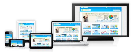
Mobile Technology is the Present and the Future
With the ever-increasing number of searches online from mobile devices, simply not having a mobile-friendly website will result in missed opportunities for your business. According to Google, 88% of consumers who do a local search on their smartphone visit or call a store within a day and 46% of all Google searches are seeking local information.
So if you serve your customers locally and don’t have a mobile-friendly website, our digital marketing experts can help. Proceed Innovative provides mobile marketing services for businesses of all industries and sizes. We can help improve the design, speed and online presence of your website so your customers can easily find and call you from their mobile devices.
Why you need local and mobile SEO services
- Mobile search engine optimization (SEO) provides local information results based on search queries and location data. Consumers who are searching their area for products or services that your business offers will find you through a local search.
- More customers prefer to support local businesses and shop locally
- Your Google My Business listing allows your customers to easily interact with your business, finding the most important information all in one spot. It is considered the storefront of your online business.
- Local and mobile SEO can save significant time for business owners. Our experts will measure and improve the performance of your listings on local directories and social media so you can focus on running your business.
Are you a good candidate for local and mobile SEO services
√ Do you service local customers?
√ Do you want to grow your business?
√ Do you feel overwhelmed with all the online options available to you?
√ Are your competitors gaining a larger share of your target market?
If your answer to any of the above questions is YES contact Proceed Innovative for local and mobile SEO services. We can help you communicate a consistent message through local and mobile representation of your brand and apply proven techniques to drive clicks and conversions from your website.
Our mobile marketing services include all of the following and more
- Competitive keyword and competitor research
- Fast-loading website across all mobile devices
- Clear, modern design to allow customers to easily scroll, read content and take action
- Clear calls to action
- Short contact forms for quick conversions
- High rankings on mobile search engine results pages
- Monthly reporting
- Ongoing maintenance and updates
Proceed Innovative will partner with you to maximize local and mobile results online. We will start by conducting a detailed keyword and competitor research and analysis to identify your target areas and keywords. After establishing your online presence in these areas, our ongoing maintenance will generate continuous leads to help you manage and grow your business.
To get a free proposal regarding our mobile marketing services, contact Proceed Innovative at (800) 933-2402.
Testimonials


Trusted by 200+ companies across the globe


